Initial thoughts:
I am really relishing the prospect of working in colour even though my subjects are quite monotone. I will need to seek out subtle nuances or invent colour based on tone. I want to explore different media. I could use:
- pastels hard/soft block and pencil
- watercolour pencils and washes
- oil pastels
- inktense blocks/pencils and washes
- acrylic paints
- coloured backgrounds, textured backgrounds
- artbars
- felt tips
- any combination
Initial experiments:
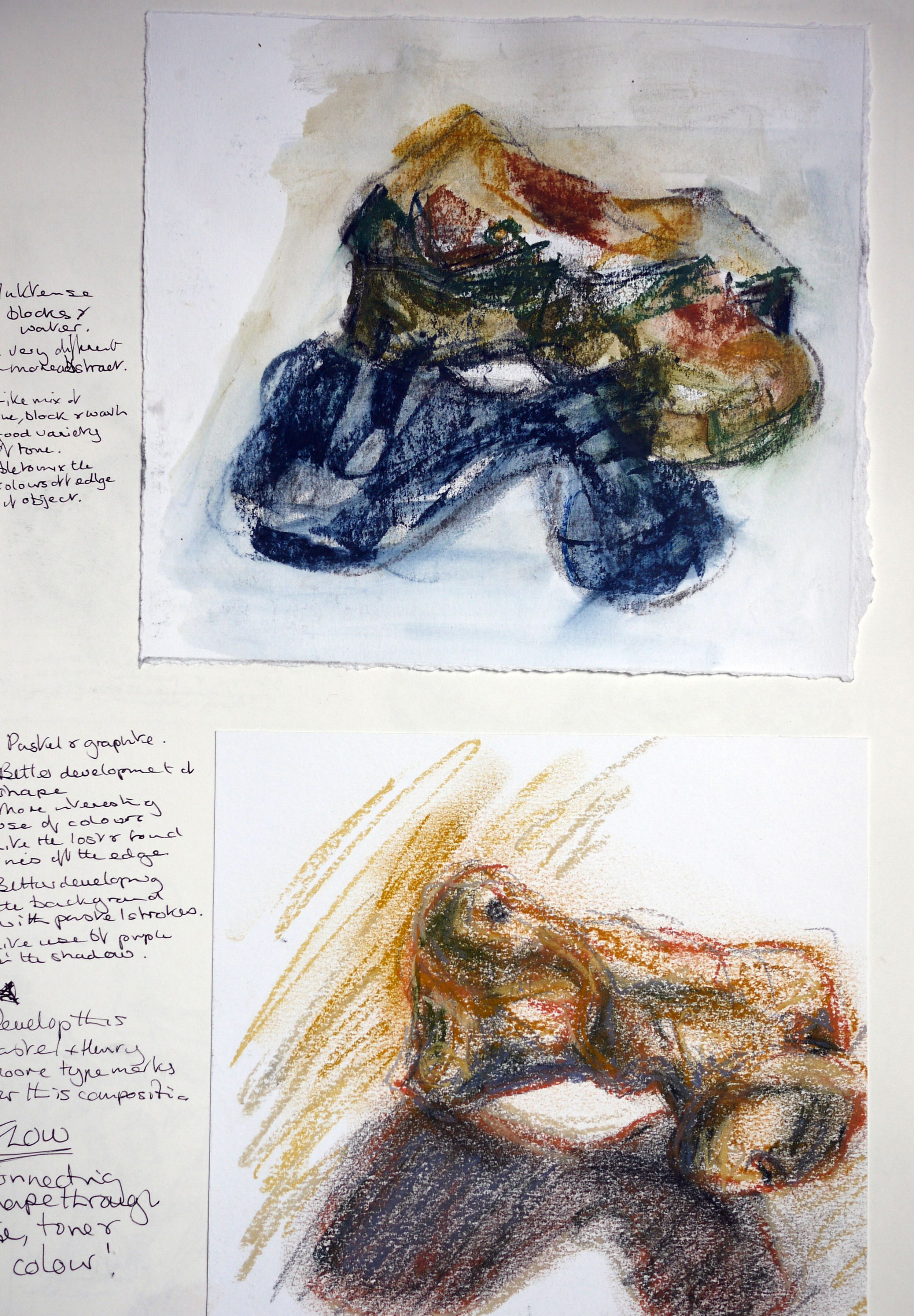
In my sketchbook, I tried out some of the media I had in mind. The cartridge paper wasn’t up to supporting some of the media, especially when I experimented mixing wet and dry marks. All the media had their merits apart from the artbars: I have not found any good modus operandi for these yet.

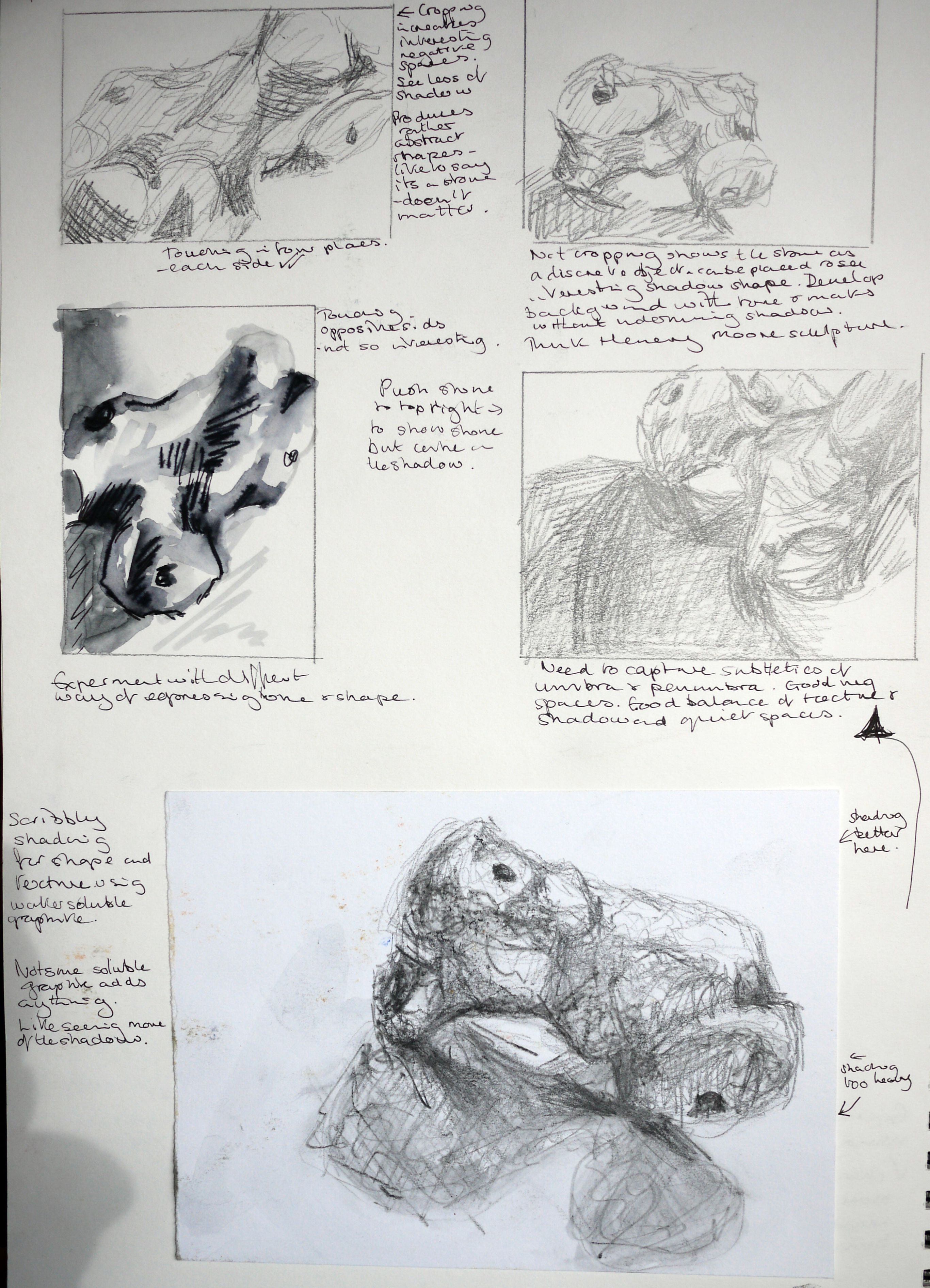
I continued my experiments on heavier cartridge and watercolour paper. I also looked at resists and ways of preparing backgrounds by washes, spattering and applying tissue paper. I found that small scale experiments didn’t always demonstrate the effectiveness of a medium, so I decided to do a number of larger works experimenting with several media.
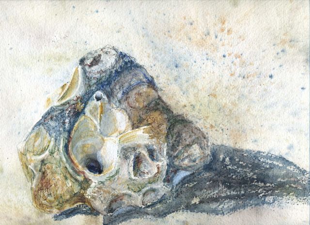
My first attempt was using inktense pencils on Arches heavy NOT watercolour paper using masking fluid to reserve highlights. I hoped that the texture of the paper would be picked up by the pencils and give a sense of the gritty surface. This didn’t really work and I found the effect quite dead and flat. The masking fluid produced a crude effect even when applied with a bamboo pen.
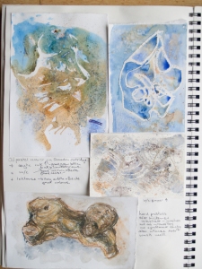
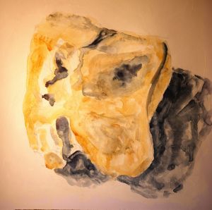
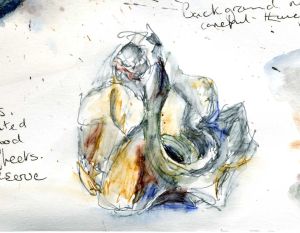
I then tried spattering ink on a heavy cartridge and used tissue paper to create texture in places. I developed this with Inktense blocks and pencils. I used white soft pastel and acrylic ink to reclaim some of the highlights. I cropped the stone into a square format.
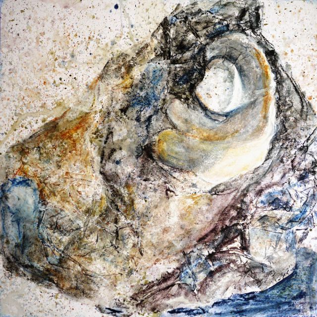 I think this was more successful in terms of the interest of the textures, tonal range and design, if not so accurately representational.
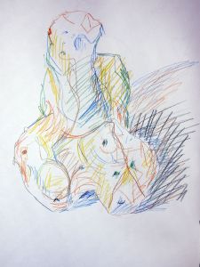
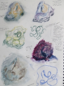
I wanted to explore a medium which I could work back into, scratch through and keep developing in order to show the sculptural shape of a stone, rather than its texture. I thought oil pastels would provide this. I lit the stone from one side with a daylight bulb which produced strong, blue shadows. I chose a limited palette of earth colours and a few cold blues, greens and purples for shadows and the traces of algae. I wanted to trace the contours of the stone in a similar way to my earlier pastel drawing.
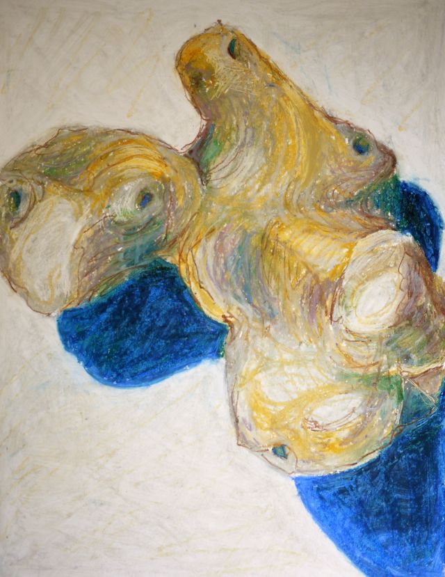
I didn’t find the oil pastels as responsive as I had hoped. I reworked areas with solvent and then layered up again and scratched through, but I couldn’t achieve the effect in my mind’s eye. I would have liked more subtle blue tones for the shadow, but my set is limited here.
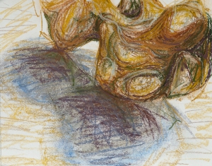
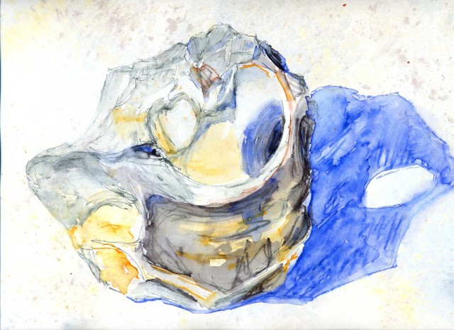
I don’t think the oil pastel is as effective as soft pastel, so I thought I would turn back to soft pastels but try an approach which concentrated on the surface textures of another stone. I brushed gesso over cartridge paper with a bristle brush to produce a textures surface with some tooth. I then loosely painted an underpainting in watercolour concentrating on tone.
When I started working into the surface with hard pastels, I found they didn’t sit very well on this surface, and soft pastel filled it very quickly. I should have used a grittier gesso. The underpainting was very dominant. I felt as though I was getting nowhere with this approach but persevered. Eventually a textural representation appeared from the murk.
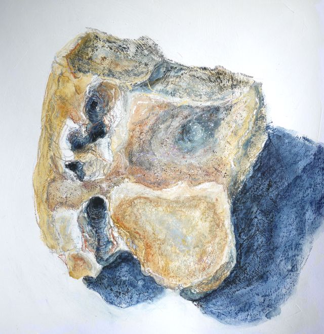
I like the way the brush strokes show through and the mixture of linear, speckled and scumbled marks. I don’t think I have accurately represented the tones on the different facets and angles of the stone, but I have captured the three dimensionality of the holes. I found it difficult to differentiate the glassy, smooth facets from the crystaline ones. Flints are so interesting.
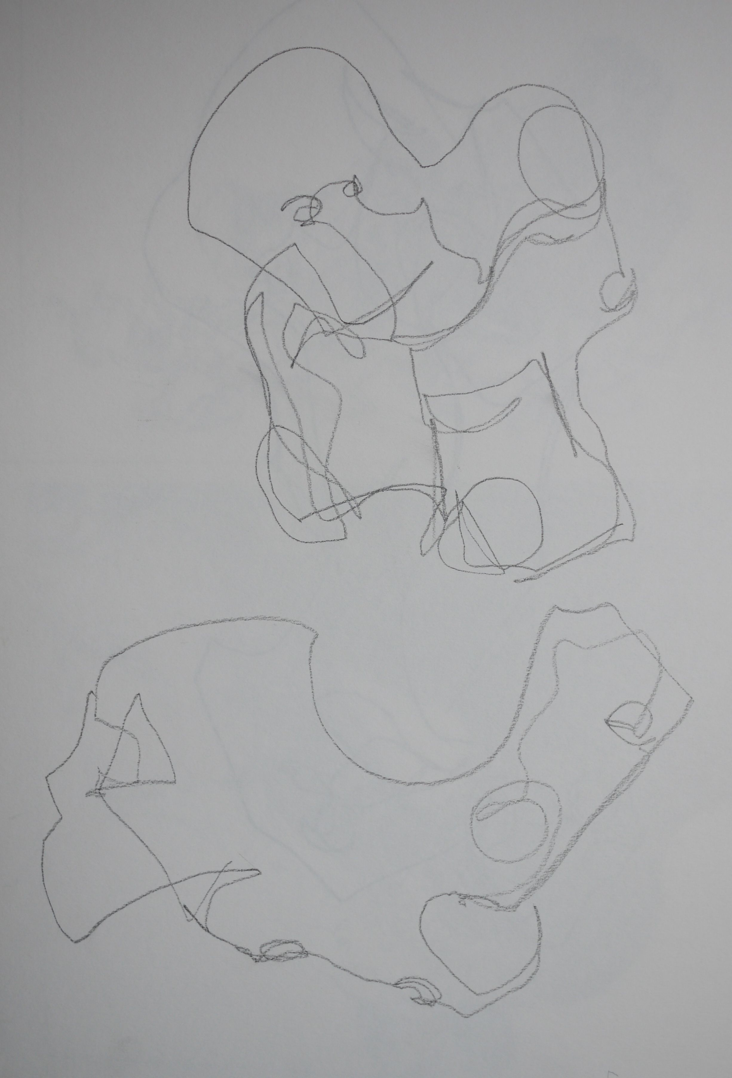
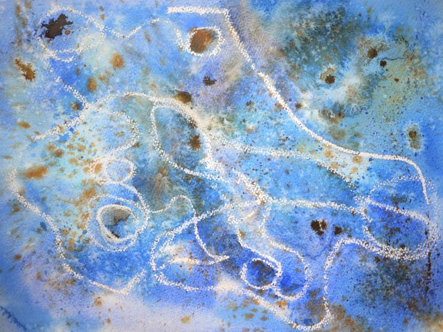
I had enjoyed the abstract shapes produced by my continuous, unsighted line drawings and wanted to see if I could develop this idea with colour. I used a white oil pastel to draw unsighted onto w/c paper. I then developed the background with washes to try and represent the texture of the surface of the stone. I used ultramarine and burnt sienna because they are complimentary colours which produce a good neutral when they mix. I dropped and spattered them back into the wash, and also used sienna acrylic ink and salt. This was great fun but I think the result isn’t especially interesting. I think it would have been better with more earth colour and a softer blue or perhaps something like Paynes Grey instead.
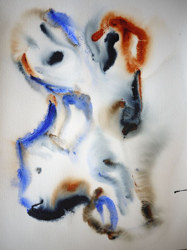
I thought it would be interesting to try the same approach in positive rather than negative. A damped a support and draw into it with my finger dipped in the neat ink. I had to work very fast. I really like the abstract effect of this and how the paint has moved on the drying paper.
In my initial experiments in my sketchbook, I had enjoyed the results of felt tip pens on a prepared background.
 I thought it as very effective at capturing glassy facets, crisp edges and highlights. I tried to develop this on a larger scale but but I don’t think it worked. The delicacy of the medium was lost.
I have really enjoyed experimenting with coloured media, and perhaps got a bit carried away. I still have not achieved what I wanted or explored every idea, but I want to move on to exploring a close up view.